

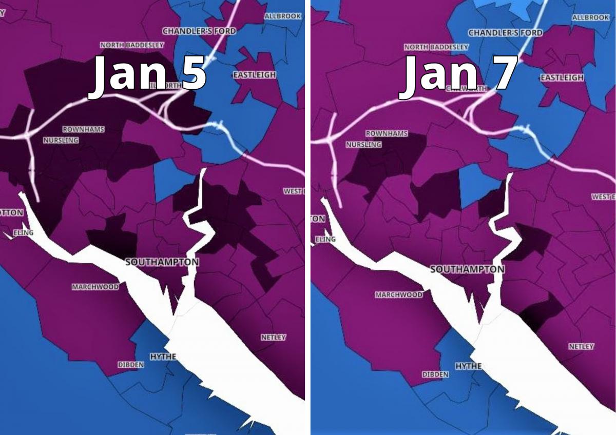
SEVEN Covid 'hotspots' have been identified in and around Southampton, but infections rates are beginning to drop, according to an interactive Government map.
The areas have been placed in Public Health England's top infection rate bracket, which means that almost one in 100 people in those districts had coronavirus in the seven-day period to January 7.
In the screenshot of the map below, places with a high infection rate appear dark purple.

This is however down on the seven days to January 5, where 12 areas were marked as 'hotspots', as shown in the map below.

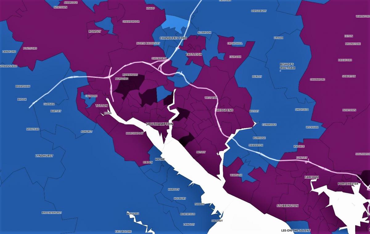
The map uses data from Public Health England to show potential virus "hotspots" in the country.
It is divided into Middle Super Output Areas (MSOAs), which are areas with an average population of 7,200.
The map colour-codes MSOAs depending on their seven day rolling rate, with areas placed into the boundaries of 0-10, 11-50, 51-100, 101-200, 201-400, 400 to 799 and 800 plus.
Places with a high MSOA rate appear on the map in light purple (400 to 799) or dark purple (800 plus).
The areas no longer classed as hotspots, but were in the seven-day period to January 5, were: Bitterne East, Bitterne West, Chilworth, Nursling and Rownhams, Freemantle, Hollybrook, Redbridge and Millbrook West, and Sholing East.
Areas with rolling rates above 800 in or close to Southampton, and have been identified as a 'hotspot':
- Aldermoor and Lordswood - 72 cases (no change) - 930.6 rolling infection rate
- Bitterne South - 49 cases (8.9% rise) - 803.3
- Coxford and Lords Hill - 52 cases (22.4% down) - 868.8
- Maybush - 69 cases (30.2% rise) - 844
- St Denys - 74 cases (15.6% rise) - 862.2
- Upper Shirley - 64 cases (56.1% ruse) - 817
- Weston - 52 cases (79.3% rise) - 866.2


Comments: Our rules
We want our comments to be a lively and valuable part of our community - a place where readers can debate and engage with the most important local issues. The ability to comment on our stories is a privilege, not a right, however, and that privilege may be withdrawn if it is abused or misused.
Please report any comments that break our rules.
Read the rules hereComments are closed on this article