


SCORES of research has been collated to show the most unhealthy areas of Southampton.
The Consumer Data Research Centre (CDRC) compiled figures to illustrate the overall health of individual districts.
Factors include the average distance to a GP surgery, hospital and pharmacy, as well as how clean the air is.
The following map shows rankings using all factors.
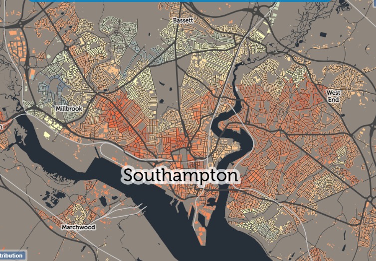
The map showing overall health in Southampton. Map by Consumer Data Research Centre (CDRC)
Banister Park is highlighted in the darkest shade of orange, meaning it is ranked in the 'worst performing decile' when compared to the rest of the UK.
Meanwhile, most of Millbrook is shown as blue, meaning it is in one of the highest performing deciles.
Each area is ranked in a 'centile', of which there are 10, for each indicator, which are known as AHAH (Access to Healthy Assets and Hazards).
The data gathered by the CDRC takes into account positive factors such as access to healthcare, GPs, hospitals, dentists, pharmacies, air quality and leisure.
Negatives, known as hazards, are also considered, such as access to fast food outlets, off licenses, tobacconists, as well as concentration of chemicals in the air.
Data is broken down even further by the CDRC with other maps to illustrate specific factors.
For example, this following map shows access to a GP. The darker the shade of green, the poorer the access is.
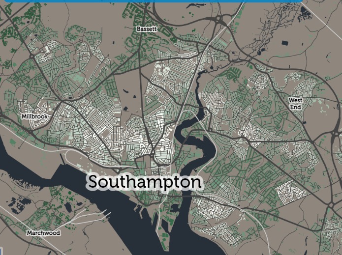
The map showing access to GPs in Southampton. Map by Consumer Data Research Centre (CDRC)
According to the data, areas like Bassett and St Mary's have some of the worst access to a GP.
Similar results are shown when the data is filtered to 'access to a dentist', as shown by the following map.
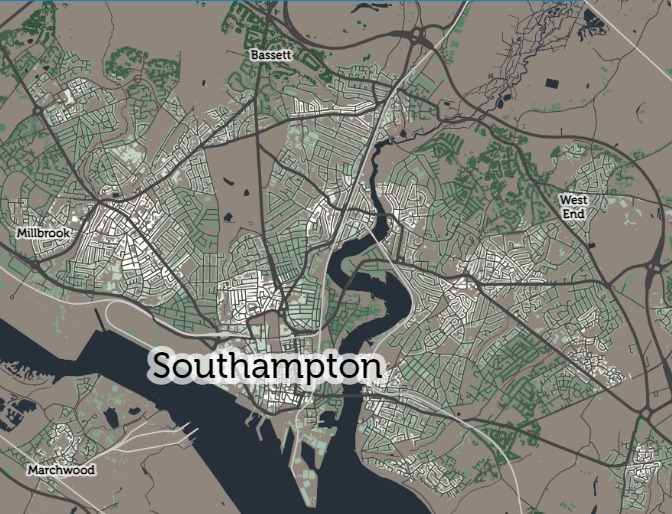
The map showing access to dentists in Southampton. Map by Consumer Data Research Centre (CDRC)
With regards hospital access, almost every district in the west side of the city is in the top three deciles.
But as the map pans further east, districts drop into the 7th, 8th and 9th deciles.
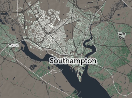
The map showing access to hospitals in Southampton. Map by Consumer Data Research Centre (CDRC)
More than half of Southampton is ranked in the lower deciles when access to a greenspace is considered.
This comes just a week after a study found fewer Southampton residents leave their homes for a walk to exercise.
Visit the CDRC website and access the interactive maps by clicking here.


Comments: Our rules
We want our comments to be a lively and valuable part of our community - a place where readers can debate and engage with the most important local issues. The ability to comment on our stories is a privilege, not a right, however, and that privilege may be withdrawn if it is abused or misused.
Please report any comments that break our rules.
Read the rules hereLast Updated:
Report this comment Cancel